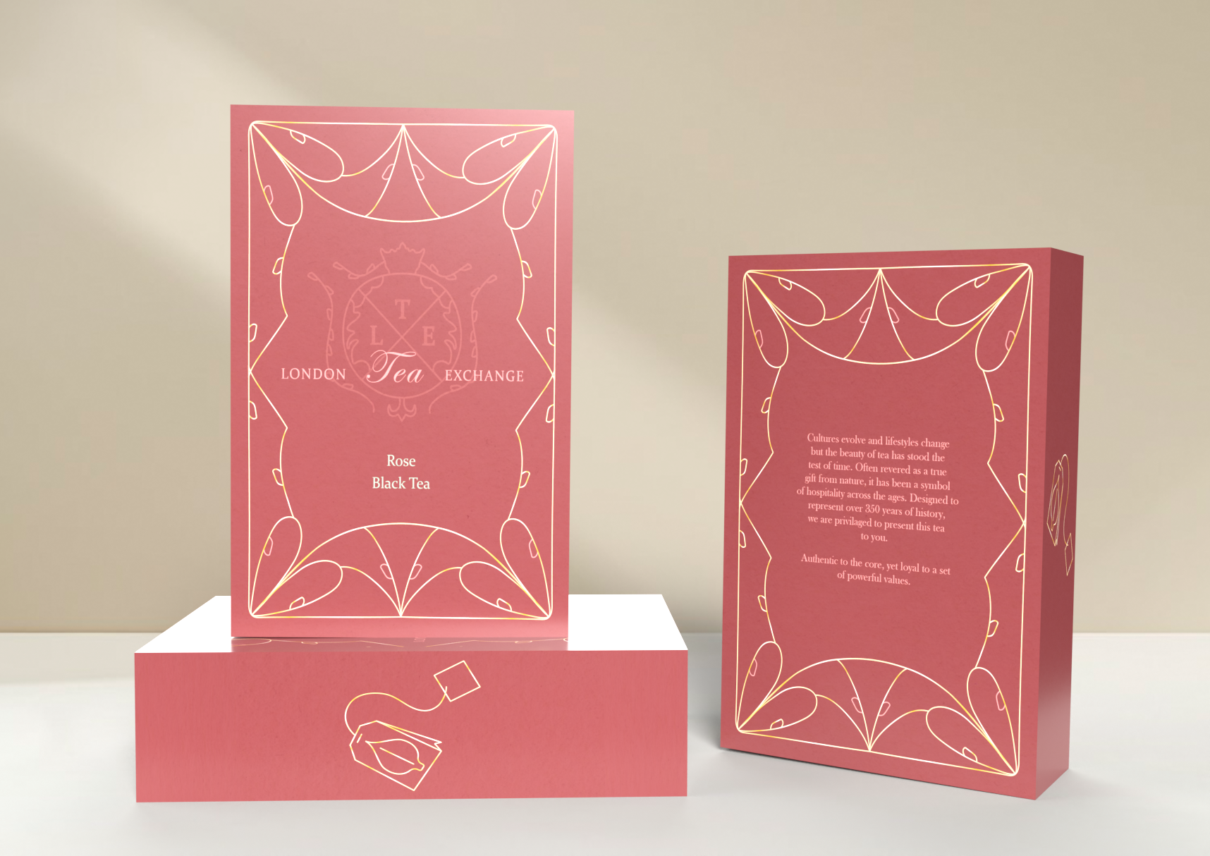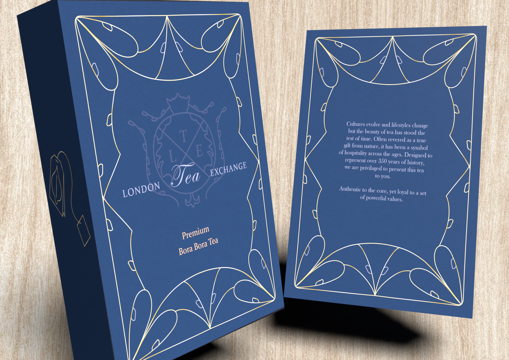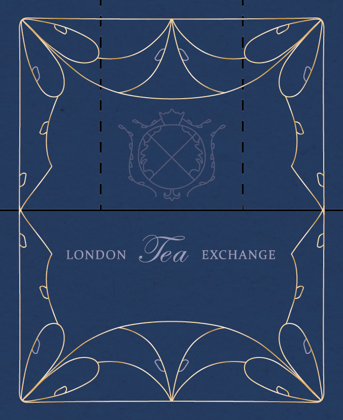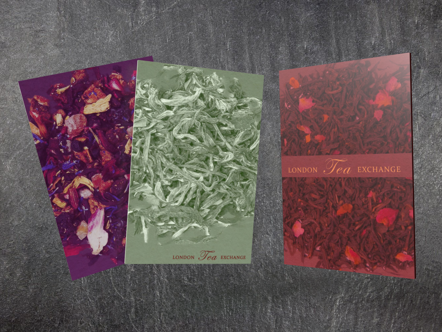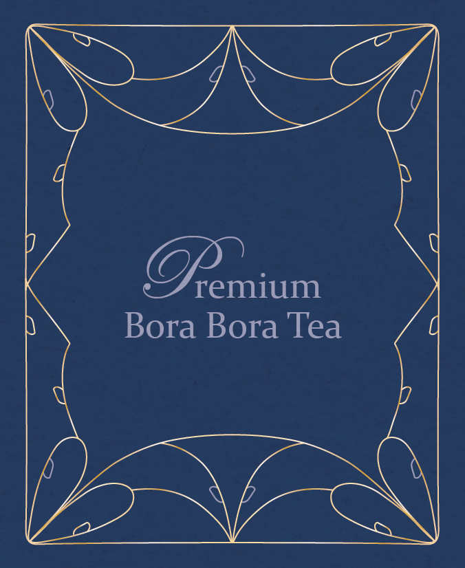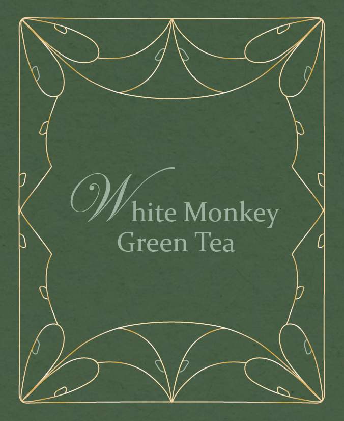
London Tea Exchange Rebrand
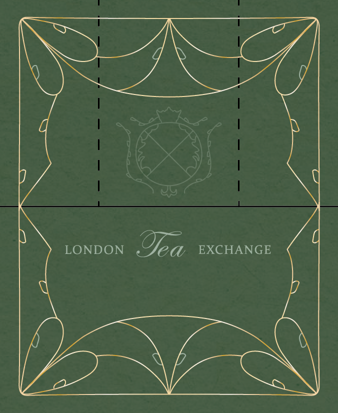
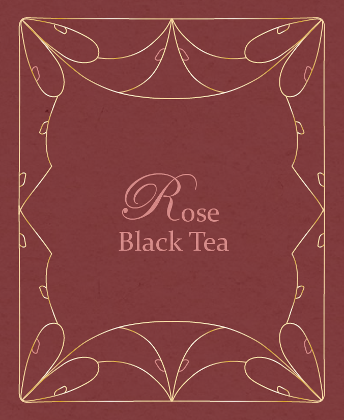
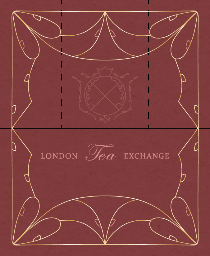
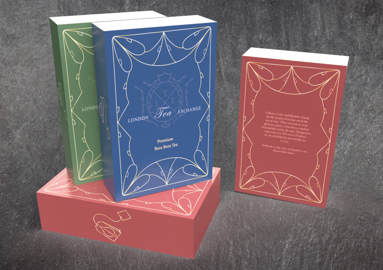
May 2023 – An identity rebrand of the London Tea Exchange. This project was about the connection between graphic style and a brand through the medium of package design. The feeling that a design can create within a room and audience. Repetition of design causes recognition within the brand. Comparing colors and finding alternatives to type and composition. Connecting multiple products together to form unity within a brand. I redesigned the logo, packaging for their tea, information cards, and tea bags.
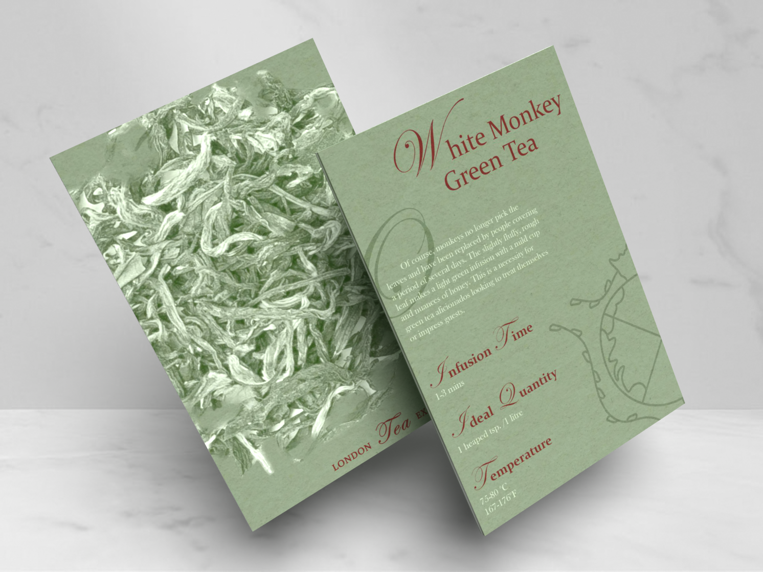
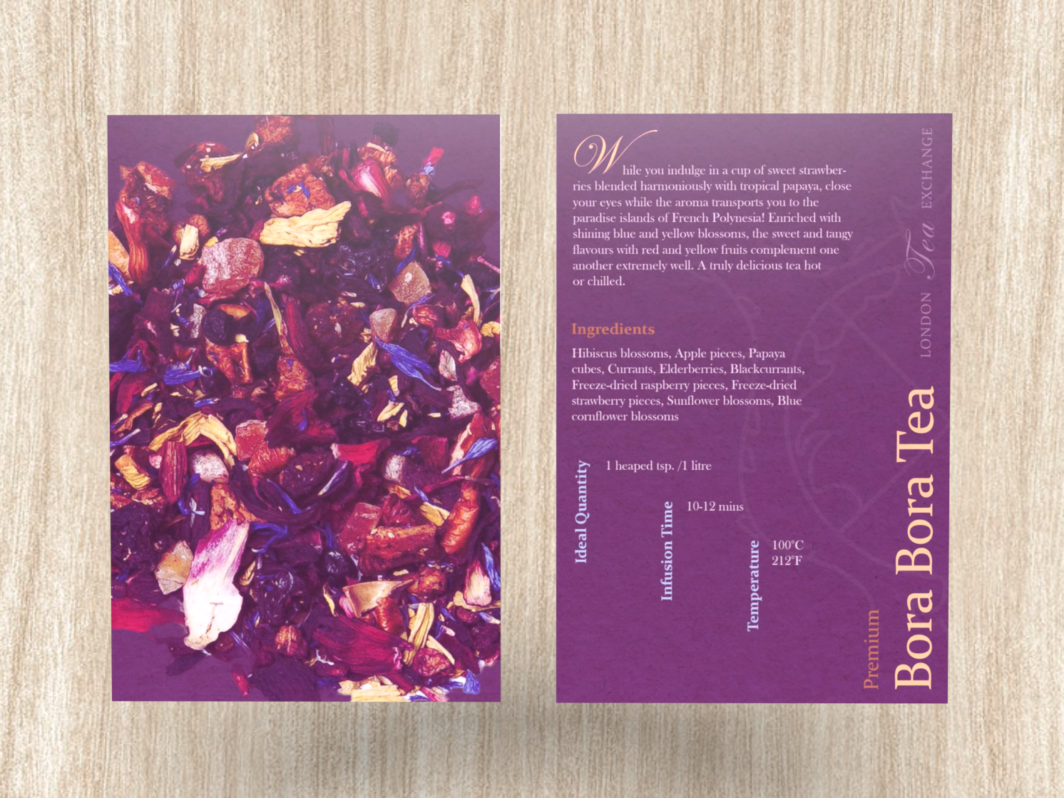
Multiple versions were designed to represent different versions of the teas being sold (ex. Green Tea, Bora Bora Tea, Black Tea). The identity manual contains color palettes, typefaces, color combinations, design elements used, and multiple alternative examples for the teabox and postcard. The design for the tea box is replicated on the tea bag. The postcard contains information for the buyer about the type of tea as well as ingredients, infusion time, quantity amount, and ideal temperature. The design as a whole presents luxury and elegance while maintaining simple detail designs that will catch the eyes of the buyers.