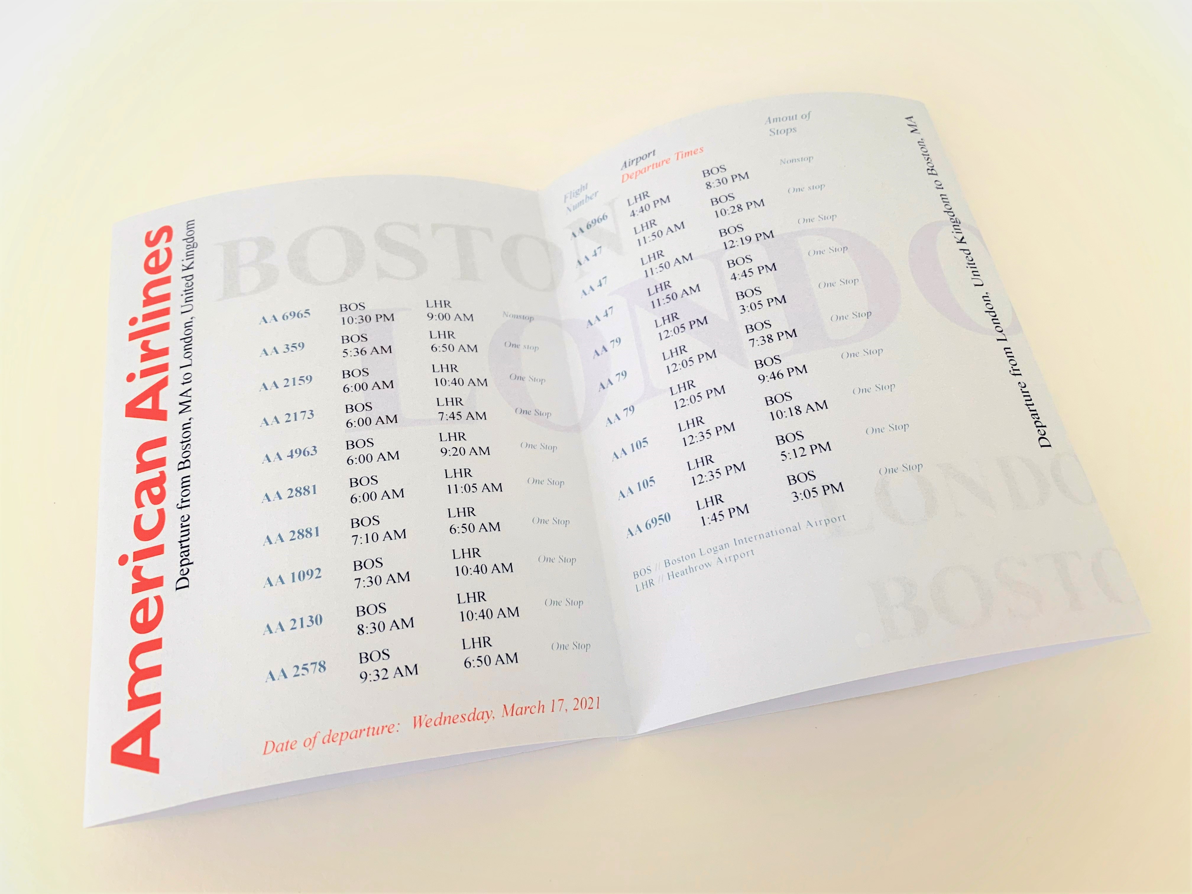
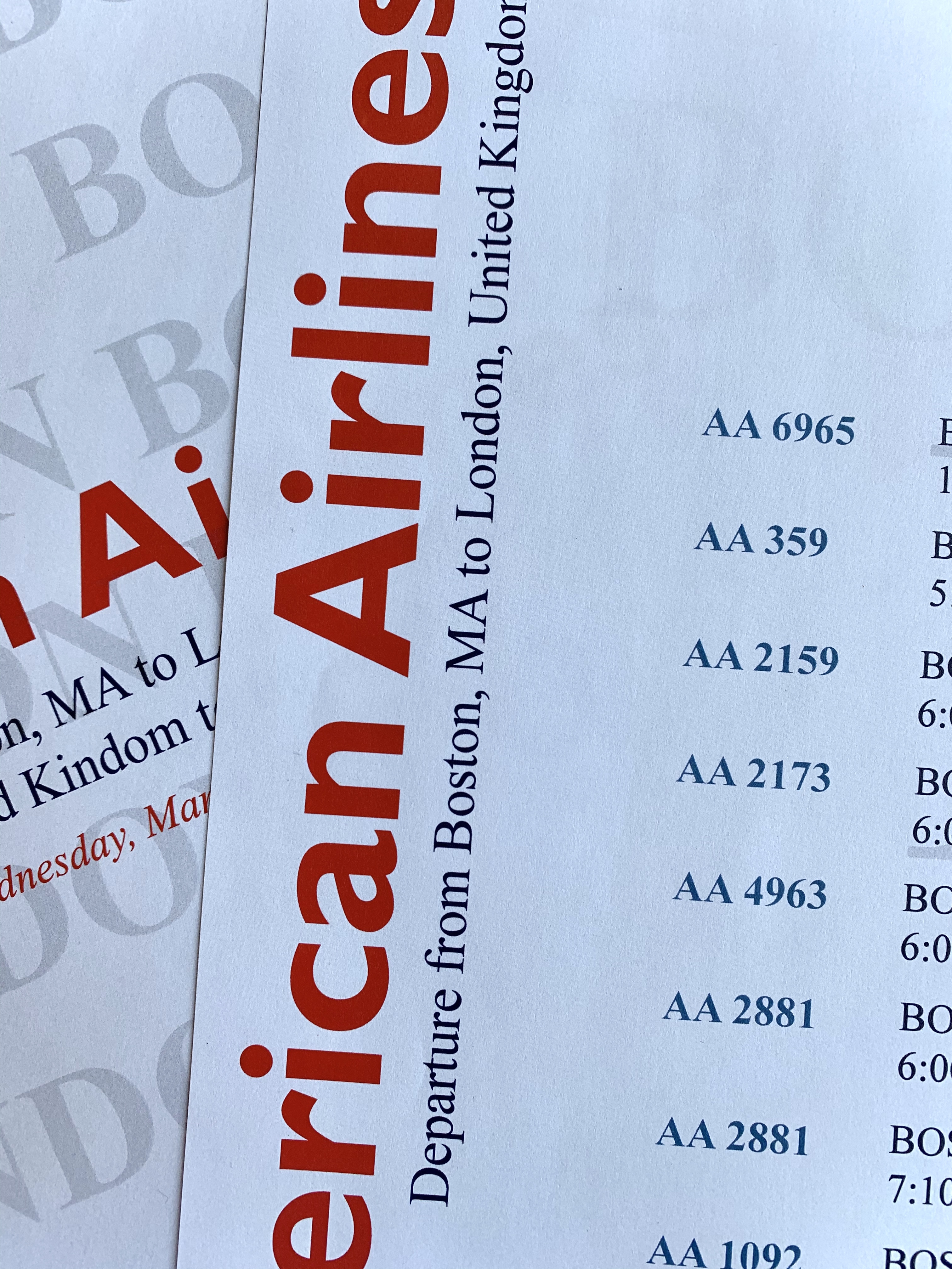
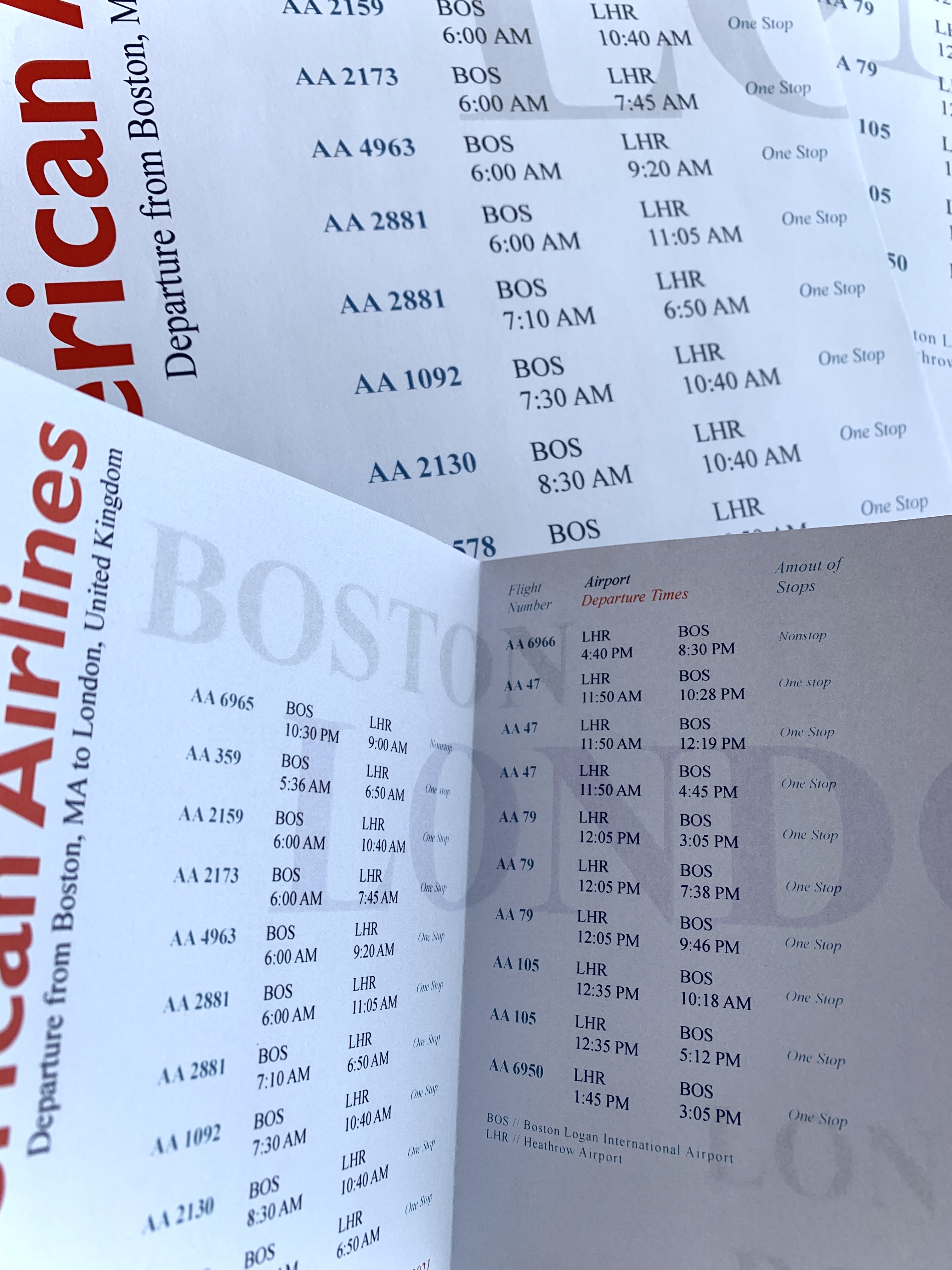
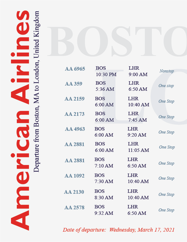
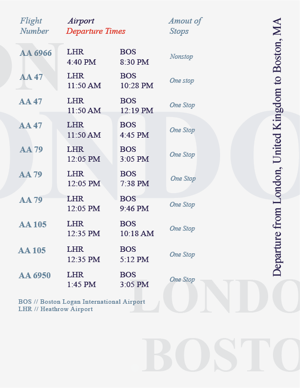
Traveling brochure
March 13, 2021 – A traveling brochure that exemplifies typography form and function. The objective was to display information efficiently and clearly. Departures and arrivals are displayed between Boston and London. The type in the background creates movement and occupies space.
The spaced-out and blocked text makes it easy for someone to read and identify the important information. The direction of the text on the first page guides the reader to flip to the next. The simple color palette portrays the same colors that are affiliated with the airline company and plane. Both colors used are easy to read on the grey background.